# Getting started
The engineer utilisation board allows you to perform a detailed analysis of the utilisation of each engineer within a region for any given time period. In addition, it provides an overview of the overall availability of engineers for the next 12 months alongside the historic utilisation over the last 3 years for comparison.
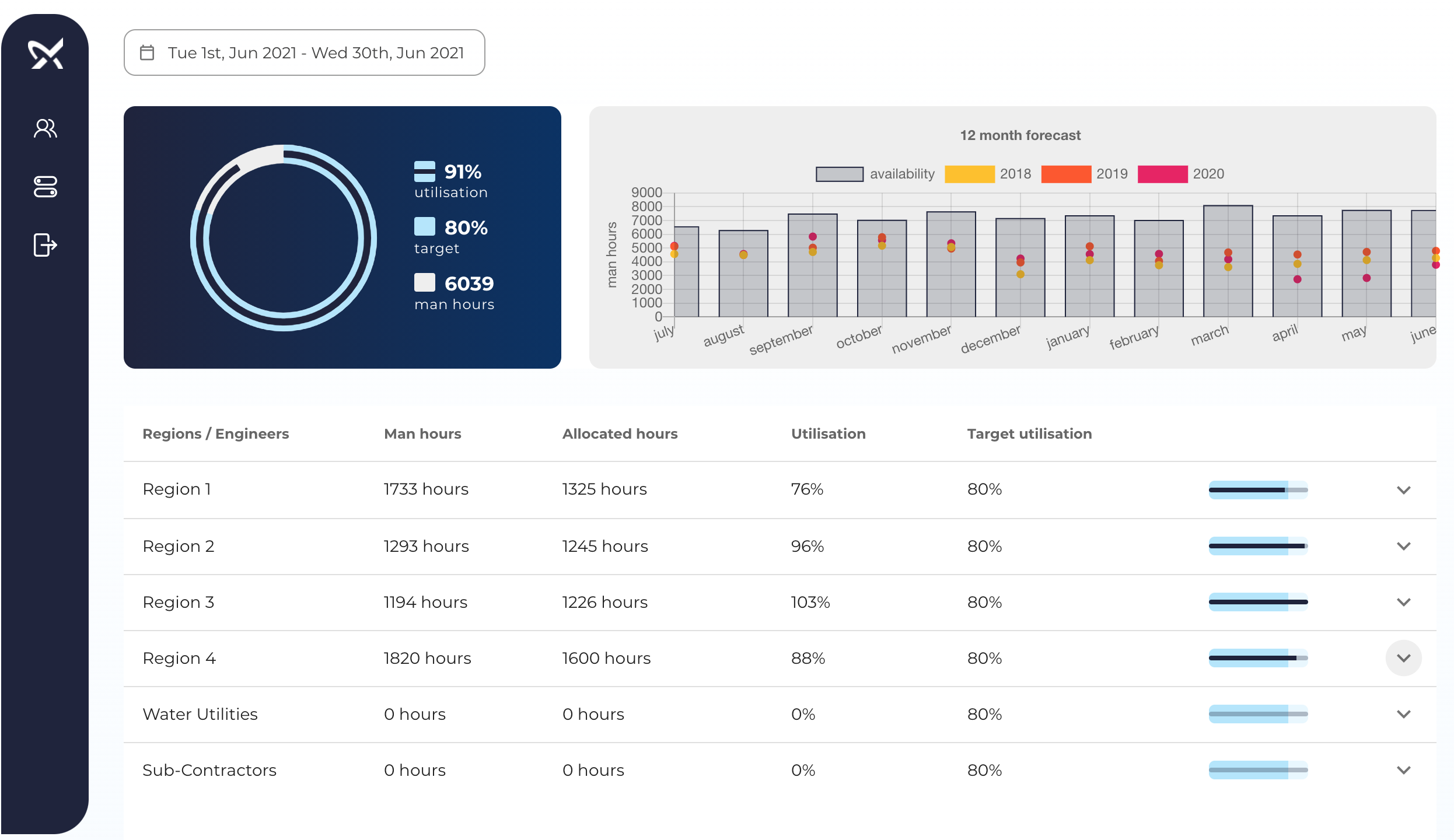
# Summary
The utilisation summary aggregates the overall metrics for the time period selected. Engineers not allocated to the main Grundfos regions (e.g. water utilities and sub-contractors) are excluded from the overall utilisation calculations.
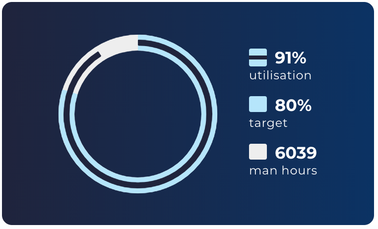
- Utilisation: the level of utilisation for all Grundfos engineers in the time period selected.
- Target: the target utilisation for all engineers.
- Man hours: the maximum available man-hours during the period selected.
- Donut chart: visual representation of the three figures above overlapped for ease of comparison.
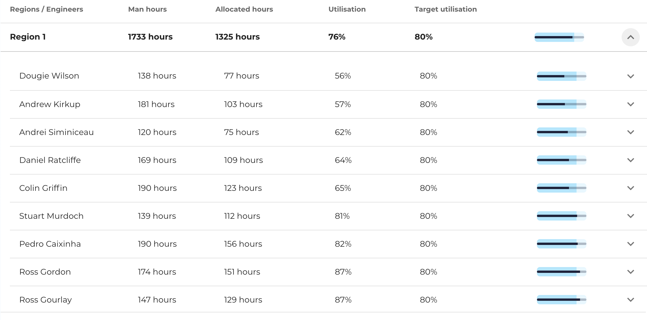
# Utilisation per region
The utilisation table shows a breakdown of the utilisation figures for each region.
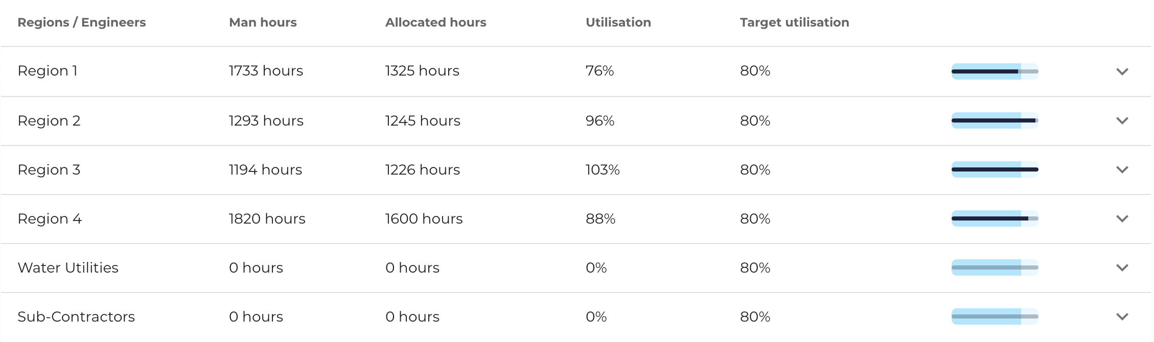
The information for each column in the table is broken down as follows:
- Regions / Engineers: displays the name of the region (i.e. Region 1, 2, etc.) or the name of the engineer if the row is expanded to show more details.
- Man hours: the sum of all man hours available for the time period selected. This figure excludes any unavailability slots from the calculation (e.g. holidays, meetings, etc.). On-call and pending work slots are counted as available working hours.
- Allocated hours: the sum of all hours where engineers were allocated on jobs. Travel times are included in this figure.
- Utilisation: the ratio between allocated hours and man hours (i.e. allocated / man hours).
- Target utilisation: generally expected utilisation rate for engineers.
- Bullet graph: visual representation of the actual utilisation rate compared to the target utilisation.
# Utilisation per engineer
You can use the arrow on the right-hand-side of each row to view detailed utilisation figures for each engineer in the region. The same figures that were shown for each region are also shown for each engineer.
# Engineer utilisation breakdown
You can use the arrow on the right-hand-side of each engineer row to view a daily breakdown of the utilisation figures for the engineer selected in the time period selected.
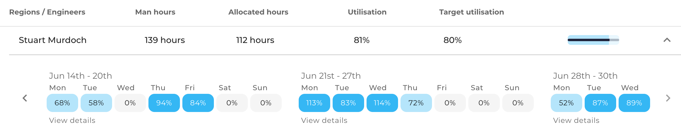
At this level, we can see the utilisation period for each day of the time period selected. Each day box is colour coded as follows:
| Colour | Description |
|---|---|
 | The level of utilisation was on or above the target of 80%. |
 | The level of utilisation was below the target and above a minimum of 40%. |
 | The level of utilisation was below the minimum of 40%. |
 | The engineer was unavailable on this day. |
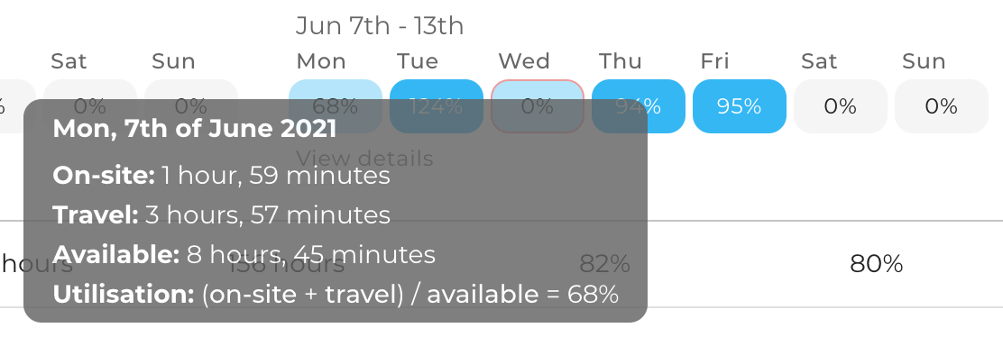
# Utilisation calculation
You can hover over any of the days in the engineer breakdown to see the details of how the utilisation figure was calculated for that day.
# Weekly allocation details
Click on view details to see the job allocations for the engineer for that particular week.
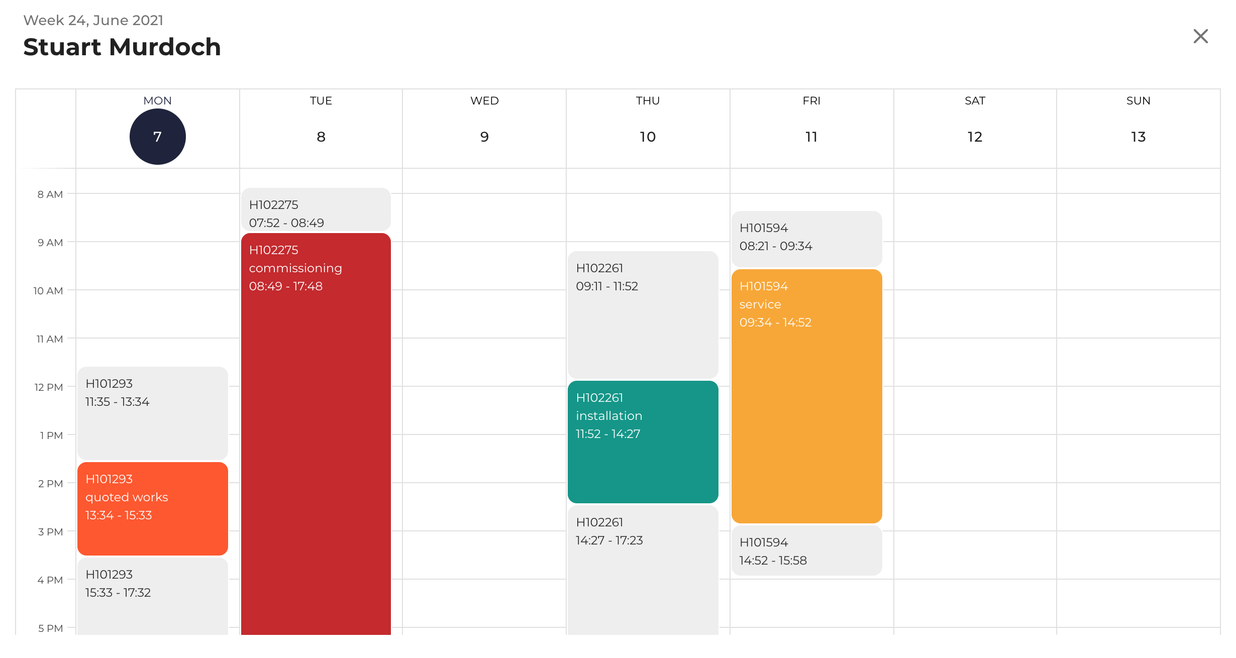
The light grey slots indicate time the engineer spent travelling to and from jobs. The coloured slots indicate time the engineer spent on site.
# Availability analysis
The availability analysis graph makes it possible to compare historic utilisation figures for each month of the year with engineer availability over the next 12 months.
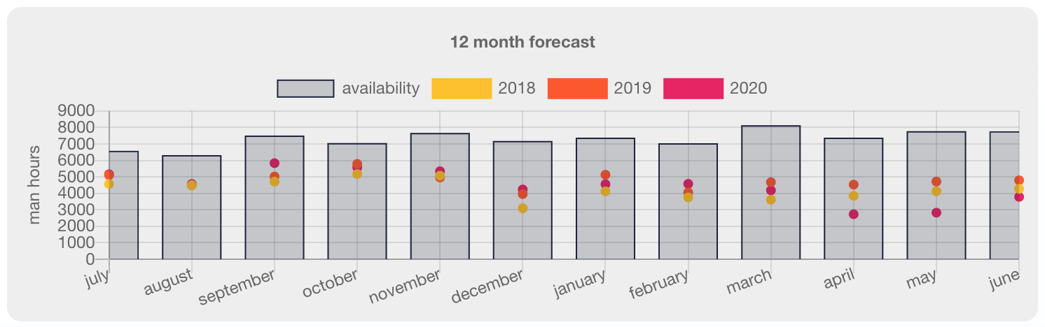
Hover on the dots to see how many man-hours are typically allocated to engineers during the same time period in the past years. Hover on the bars to see how many man-hours are available for the entire team for a particular month in the year.
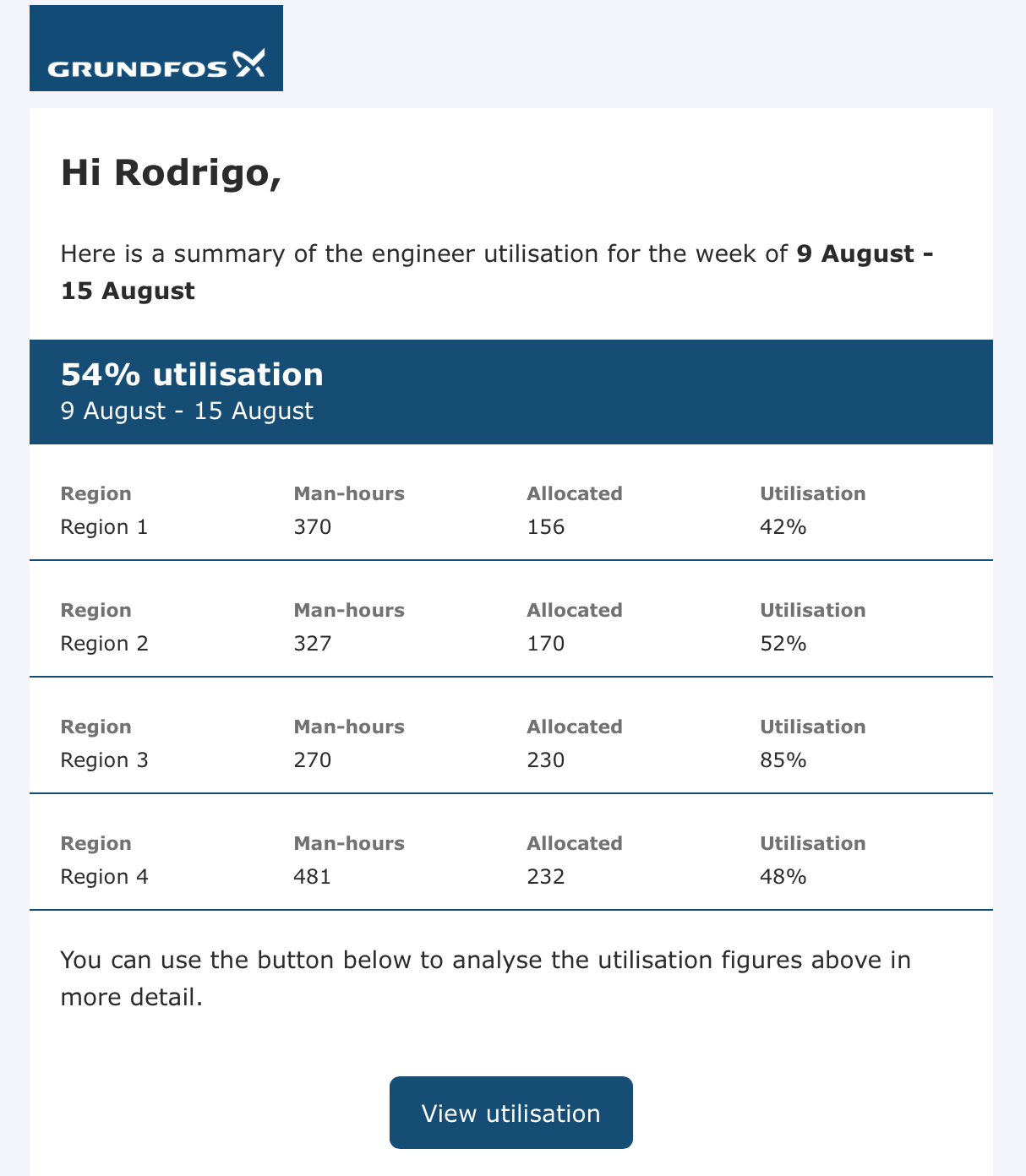
# Weekly e-mail notification
If you are in the recipient list for utilisation notifications, at the end of each week you will receive an e-mail that summarises the utilisation figures of all regions one week in advance. This notification should help you identify low utilisation periods and address them ahead of time, if needed.